Search engine rules are always evolving.
"Starting April 21, we will be expanding our use of mobile-friendliness as a ranking signal. This change will affect mobile searches in all languages worldwide and will have a significant impact in our search results."

Search Engine Optimization (SEO)

How to make website "mobile-friendly" ?
Mobile vs. Adaptive (AWD) vs. Responsive (RWD)

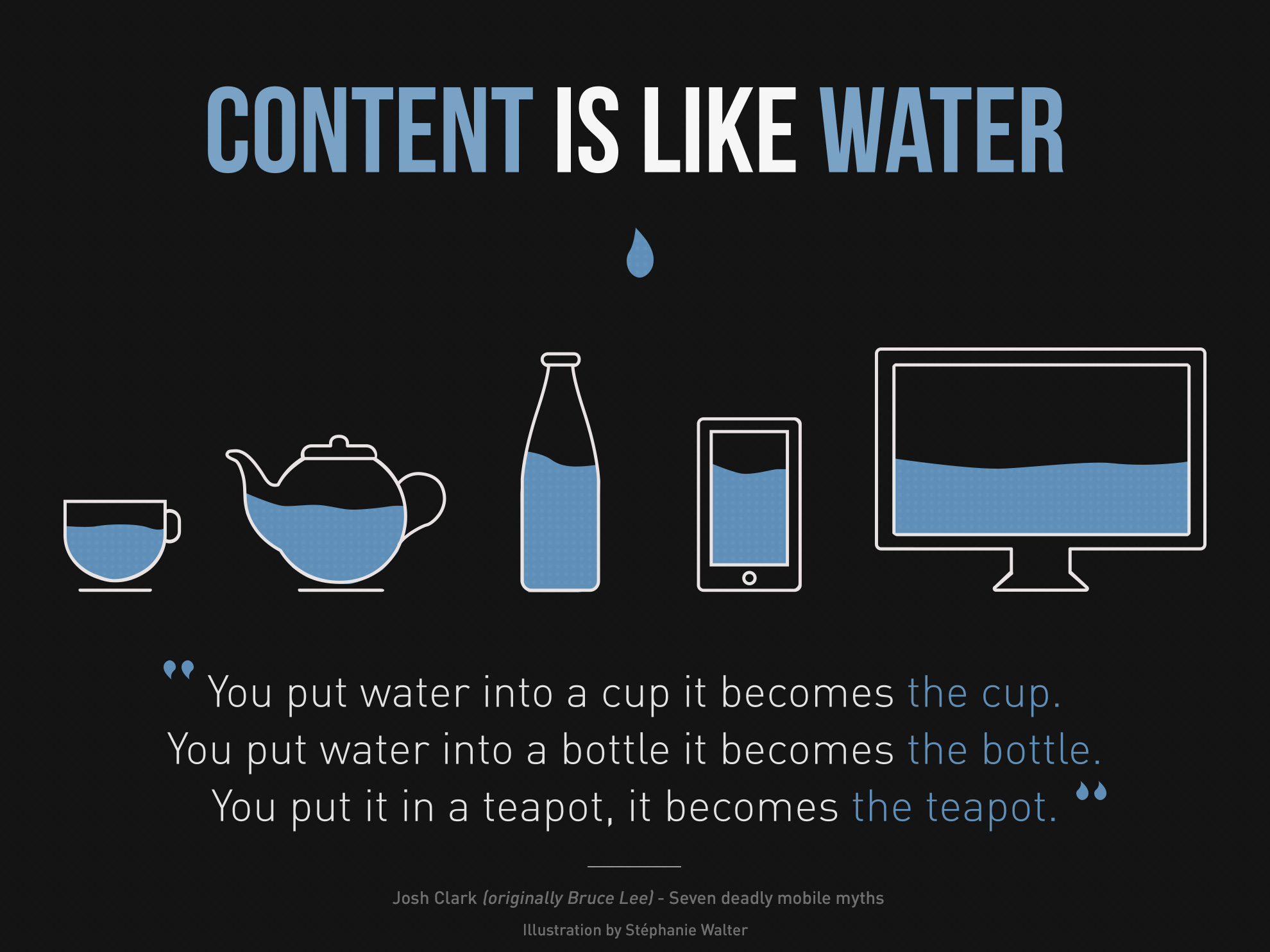
9 GIFs That Explain Responsive Design Brilliantly
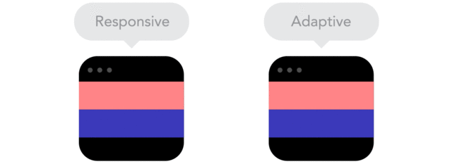
Responsive designs fluidly expand, whereas adaptive designs hitch as you expand a browser or viewport.
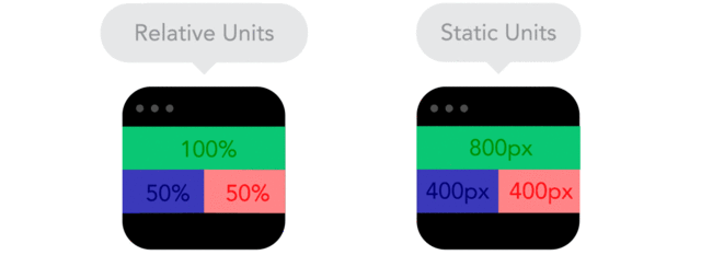
Positioning your designs elements using pixels as X,Y coordinates can cause a site designed for one screen to look weird on another. Use relative units, like percent of the screen, instead of static units like pixels.

By using nesting elements, you can make it so collections of onscreen elements adapt to a shrinking or expanding screen as one, instead of individually.
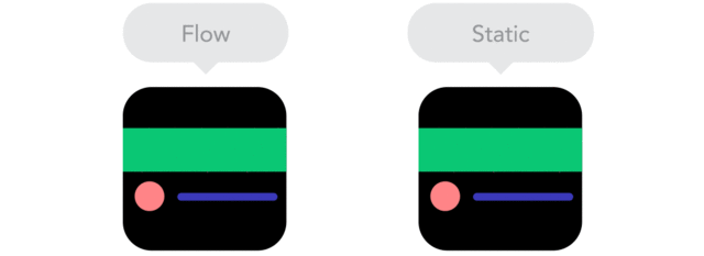
"As screen sizes become smaller, content starts to take up more vertical space and anything below will be pushed down. It's called the flow."

"Breakpoints allow the layout to change at predefined points, i.e. having three columns on a desktop, but only one column on a mobile device."

"Sometimes it's great that content takes up the whole width of a screen, like on a mobile device, but having the same content stretching to the whole width of your TV screen often makes less sense."
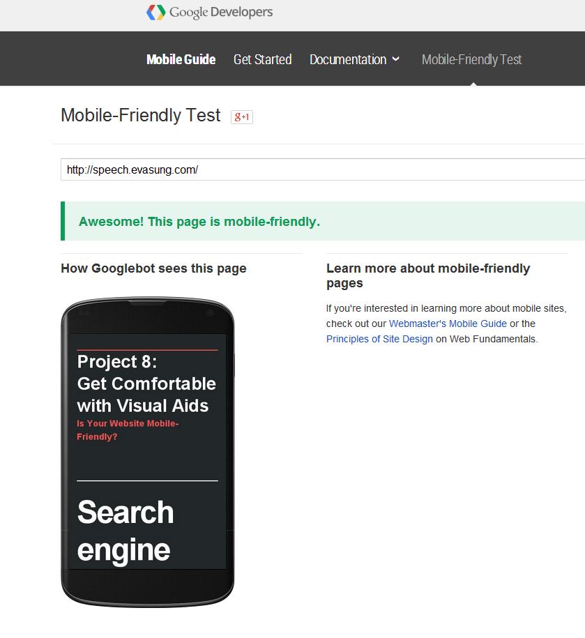
Mobile-Friendly Test

The Bottom Line